Navbar Types
Choose between Navbars
NavbarRouter supports three types of Navbar as of today standard which is basically material design 2 BottomNavigationBar (default for this package) and notched a customized NavigationBar with a notch and a material3 Navbar. User can choose to use either of them by setting the type property of the NavbarRouter widget to either NavbarType.standard, NavbarType.notched, NavbarType.material3 or NavbarType.floating.
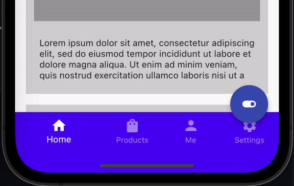
Standard Navbar
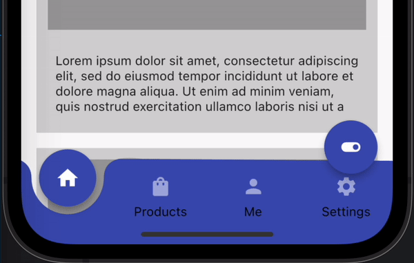
Notched Navbar
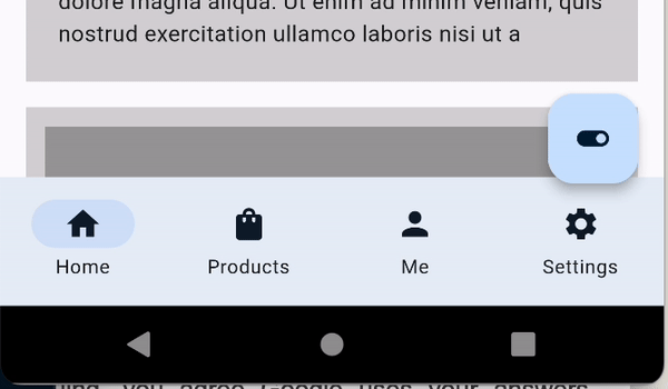
Material 3 Navbar
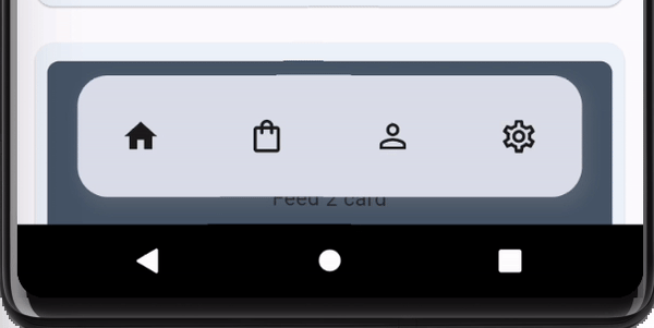
Floating Navbar
The height of each Navbar can be accessed through the constants kM3NavbarHeight
kStandardNavbarHeight, kNotchedNavbarHeight and kFloatingNavbarHeight respectively.
Decorating the Navbar
NavbarDecoration is a base decoration class for all the Navbar types. It provides a way to customize the Navbar, Each of the Decoration corressponds to the respective Navbar type.
-
NavbarDecorationfor Standard Navbar -
NotchedDecorationfor Notched Navbar -
M3NavbarDecorationfor Material3 Navbar -
FloatingNavbarDecorationfor Floating NavbarBottomNavigationBarType navbarType: The type of the Navbar to be displayed [BottomNavigationBarType.fixed] or [BottomNavigationBarType.shifting]
backgroundColor
Color?The backgroundColor of the Navbar
isExtended
boolDefines whether the Navbar is extended in Desktop mode defaults to false
unselectedItemColor
Color?The unselectedItemColor of the Navbar
elevation
double?The elevation shadown on the edges of bottomnavigationbar
minWidth
double?The smallest possible width for the navbar when `NavbarRouter.isDesktop` is true, this width is regardless of the navbar's icon or label size.The default is 72.
minExtendedWidth
double?Width when `isExtended` is True, The default value is 256.
unselectedIconColor
Color?The color of the unselected item icon
selectedIconColor
Color?The icon color of the selected NavbarItem if NavbarItem.selectedIcon is specified then this is ignored
showUnselectedLabels
boolWhether or not to show the unselected label text, When in DesktopMode, either isExtended is False or showUnselectedLabels is True
unselectedLabelColor
Color?The color of the unselected label text
showSelectedLabels
bool?whether or not to show the selected label text
enableFeedback
bool?haptic feedback when the item is selected
margin
EdgeInsetsGeometrymargin for floating navbar defaults to EdgeInsets.symmetric(horizontal: 48.0, vertical: 20),
selectedLabelTextStyle
TextStyle?the text style of the selected label
unselectedLabelTextStyle
TextStyle?the text style of the unselected labels
selectedIconTheme
IconThemeData?iconTheme for the selected icon
unselectedIconTheme
IconThemeData?iconTheme for the unselected icon
indicatorColor
Color?The value of NavbarRoute's selection indicator color for the selected item
borderRadius
BorderRadius?BorderRadius for floating navbar
labelBehavior
NavigationDestinationLabelBehavior?Specifies when each [NavigationDestination]'s label should appearThis is used to determine the behavior of [NavigationBar]'s destinations
height
double?The default height of the NavbarRouter when not in Desktop mode. The height of each Navbar can be accessed through the constants [kM3NavbarHeight] [kStandardNavbarHeight], [kNotchedNavbarHeight] and [kFloatingNavbarHeight] respectively.
indicatorShape
ShapeBorder?