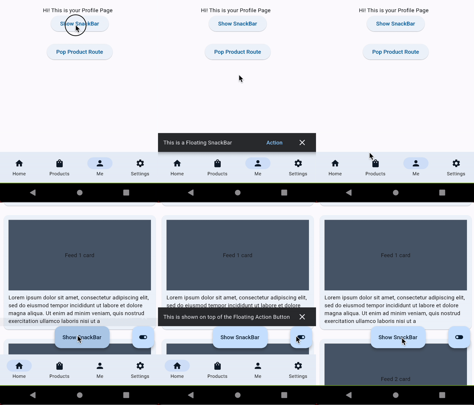
Snackbar
Showing Snackbars with NavbarRouter
Source material design 3 website
Snackbar is a component that is used to display a message for a short period of time and then automatically disappear. It can be used to display a short message or an action that a user has performed. It is a good way to give feedback to the user.

Showing Snackbar with NavbarRouter is very easy. You just need to use the showSnackbar method of the NavbarRouter. The showSnackbar method requires a context and a message.
Note: You will need to wrap your
NavbarRouterwithin a builder, if the parent of NavbarRouter does not contain a Scaffold, see the example for more details.
NavbarNotifier.showSnackBar(
  context,
  "This is shown on top of the Floating Action Button",
);
And hide it using the NavbarNotifier.hideSnackBar method.
NavbarNotifier.hideSnackBar(context);
Note that This api supports minimal customization as of now and intends to add all the customization options that the material design snackbar supports.
Supported customization options:
- showCloseIcon: Whether to show the close icon or not. (defaults to true)
- actionLabel: The label of the action button. Both onPressed and actionLabel are required to show the action button.
- onPressed: The callback to be called when the action button is pressed. Both onPressed and actionLabel are required to show the action button.
- duration: The duration for which the snackbar should be shown. (defaults to 3 seconds)
- bottom: The margin from the bottom of the screen. (defaults to [kNavbarHeight])